Warm Neutrals, Hot Market: 2026 Colors Buyers Love
- Marc Winter
- Oct 20, 2025
- 3 min read
This NAR article highlights how paint companies are moving away from bold, statement-colors and instead embracing earth-toned neutrals for 2026.

But why should a real-estate professional or homeowner care? Here are a few key takeaways from the article:
Staging and resale value: A home that is neutrally and tastefully colored tends to appeal to a broader audience, helping potential buyers imagine themselves in the space rather than being distracted by bold, polarizing colors.
Interior & exterior harmony: The 2026 palette emphasizes cohesion—wood tones (like the stain “Special Walnut” from Minwax) are also part of the trend, meaning finishes, flooring, cabinetry, and décor can all work together.
Quality and comfort: The language in the article emphasizes “understated elegance,” “quiet confidence,” and “comfort, quality and connection.” These are emotional cues that help homes feel upgraded and inviting—even without major renovations.
On-trend but timeless: Because the palette leans neutral and natural, rather than flashy, these colors are less likely to feel dated in a year or two, which is important when you consider staging for resale.
In short: aligning home décor, paint choices, and finishes with these 2026 trends isn’t just aesthetic—it’s strategic.
How to Apply the 2026 Color Palette in Practice
If you’re a homeowner, agent, or stager, here’s a practical checklist:
Base wall colors: Consider neutral, warm tans or khaki tones (like Universal Khaki) for living rooms, open-plan spaces, etc.
Accent walls / architectural features: Introduce deeper tones from the palette—terracotta, burgundy, or muted blues/greens—to add character without overwhelming.
Wood finishes & trim: Use natural wood (or wood-look) finishes in mid- to warm tones (e.g., “Special Walnut”) to link floor, trim, built-ins.
Furniture & textiles: After you’ve set your static finishes (walls, trim, flooring), layer in soft furnishings (rugs, pillows, curtains) in complementary hues from the 2026 collection.
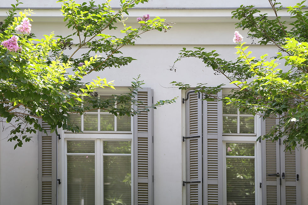
Exterior consideration: Don’t neglect the curb appeal. A neutral exterior (cream, tan) combined with accent shutters or doors in one of the deeper hues can feel fresh and coordinated.
Photography & listing visuals: Ensure your listing photos reflect the warm, inviting tone. Over-cool or ultra-bright colors may contrast poorly with the new trend and may feel less aligned with the buyer’s eye.
Budget-friendly tweaks: You don’t need a full renovation. One fresh coat, updated textiles, and a few accent pieces can go a long way to bring your home into line with these subtler trends.
Connecting It to Tobyhanna, PA
Now let’s zero in on how this applies specifically to the market in Tobyhanna, Pennsylvania.
1. Embracing the natural surroundings
Tobyhanna’s homes often equal with nature: pine trees, streams, hilly landscapes. A home painted in 2026 earth-inspired palette blends into the surroundings rather than standing out awkwardly. That sense of “home in nature” becomes a selling point.
2. Vacation-to-residential transition
Many homes in Tobyhanna may have been designed originally for vacation or rental use and may have bold accent colors, heavy décor styles, or dated finishes. Applying a more refined neutral palette elevates the home’s look—making it appealing both to vacation renters and permanent homeowners.
3. Exterior and community value
Because many Tobyhanna homes have external natural features (stone facades, wood siding, large decks), pairing those elements with the 2026 palette can modernize without losing the rustic charm.
Practical tips for local homeowners/agents
For listings in Tobyhanna: Consider a refresh of exterior siding or deck stains to mid-warm wood tones, and repaint interiors in warm neutrals to maximize appeal.
For interior staging: Use accent pieces that reflect local nature—pinecone décor, lake-blue pillows, forest-green throws—but keep walls and large structures neutral.
For rental or second-home properties: Choose durability with quality finishes in neutral tones, then adapt textiles seasonally (snowy winter textures, lake-summer colors) rather than repaint frequently.
Emphasize in marketing: “Blends with mountain/lake surroundings / Fresh neutral-tone finishes for 2026 design appeal” — this will resonate with buyers looking for the Poconos lifestyle.
Thinking about selling? Contact us! We'll handle all the details.
_edited.png)


Comments